Introduction to Cyberpunk
Cyberpunk. Just saying the word conjures up images of neon-lit cities, towering skyscrapers, and a future where technology intertwines with humanity in unexpected ways. This subgenre has captivated our imaginations since its inception, blending elements of science fiction, dystopia, and social commentary. Yet one symbol stands out amidst this gritty landscape: the cyberpunk logo. With its striking design and bold aesthetics, it captures the essence of everything we love about this genre. But when did it first emerge? And how has it shaped pop culture as we know it today? Let’s dive into the fascinating evolution of the cyberpunk logo and discover what makes it an enduring icon in modern society.
Origins of the Cyberpunk Logo
The origins of the cyberpunk logo can be traced back to the 1980s, a vibrant period in science fiction. It was a time when neon lights and gritty urban landscapes captivated audiences.
Writers like William Gibson and Bruce Sterling painted futures filled with technology and dystopian realities. This aesthetic began influencing visual art and design, leading to a distinct style that would define cyberpunk.
Graphic designers embraced bold colors, angular shapes, and futuristic fonts. The initial logos featured elements reminiscent of circuits or digital networks, symbolizing the fusion of man and machine.
As video games gained popularity, these designs evolved further. They became more recognizable as franchises adopted them for branding purposes. This helped establish a standard look that fans came to associate with the genre’s essence.
Today’s version reflects not just aesthetics but also a cultural movement rooted in rebellion against corporate control.
Evolution of the Cyberpunk Logo
The evolution of the cyberpunk logo reflects the genre’s dynamic nature. Initially, designs were simplistic, often featuring bold typography and neon colors that mirrored the vibrant aesthetics of 1980s retro-futurism.
As technology advanced, so did design techniques. Logos began to incorporate intricate patterns and digital motifs. This shift aligned with advancements in graphic software, allowing for more complexity and style.
In recent years, we’ve seen logos embracing a darker palette. The combination of sleek lines with glitch effects encapsulates themes of dystopia and rebellion inherent in cyberpunk culture.
Emerging trends showcase adaptability too; minimalist approaches now coexist alongside detailed illustrations. This duality emphasizes both nostalgia and modernity within the cyberpunk movement.
Today’s iterations are not just visual representations but symbols that resonate deeply with fans worldwide, capturing an ever-evolving narrative forged by innovation and creativity.
Impact of the Cyberpunk Logo on Pop Culture
The cyberpunk logo has become an emblem of rebellion and futurism. Its striking aesthetics resonate deeply within various cultural spheres.
In film and literature, you’ll find it stamped across dystopian narratives. Movies like “Blade Runner” and shows such as “Altered Carbon” showcase visuals that echo its essence.
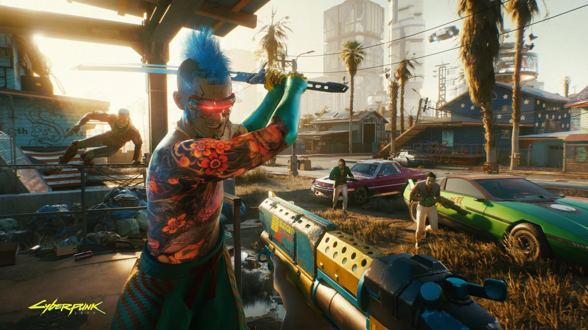
Gaming is another arena where the logo thrives. Titles like “Cyberpunk 2077” have popularized this imagery, attracting fans who appreciate its gritty allure.
Fashion has also embraced cyberpunk elements, influencing streetwear designs with neon colors and sleek silhouettes. This fusion creates a unique blend of technology and art in everyday life.
Music genres like synthwave draw inspiration from this iconic symbol, reflecting on themes of nostalgia intertwined with futuristic sounds. The cyberpunk logo continues to inspire creativity across all mediums.
Famous Examples of the Cyberpunk Logo
The cyberpunk logo has appeared in various media, each time amplifying the genre’s aesthetic. One of the most recognizable is from William Gibson’s “Neuromancer.” The book cover features a striking design that captures the essence of a neon-lit dystopia.
Another iconic representation comes from the tabletop RPG “Shadowrun.” Its logo blends futuristic elements with urban grit, embodying themes of corporate power and rebellion.
Video games have also embraced this visual identity. CD Projekt Red’s “Cyberpunk 2077” showcases an edgy logo that resonates with players seeking immersive worlds filled with technology and societal decay.
Anime series like “Ghost in the Shell” utilize logos that reflect both beauty and chaos, symbolizing humanity’s relationship with machines. Each example brings its unique flavor while reinforcing cyberpunk’s enduring allure across different platforms.
Controversies Surrounding the Use of the Cyberpunk Logo
The cyberpunk logo has sparked various controversies over the years. For some, it represents rebellion and individuality. However, others see it as a tool of commercialization that dilutes its original meaning.
Critics argue that major corporations have co-opted the logo for profit, betraying the subculture’s roots in anti-establishment sentiments. This appropriation raises questions about authenticity in an era where branding often overshadows ideology.
Additionally, debates around copyright infringement have emerged. Various artists and designers claim their work has been mimicked or misrepresented within this aesthetic framework without proper credit.
Social media plays a role too, amplifying differing opinions on what the logo signifies today versus its beginnings. Some enthusiasts feel protective of its legacy while others champion freedom of expression through adaptation and reimagining.
The Enduring Legacy of the Cyberpunk Logo
The cyberpunk logo has become more than just a symbol; it’s a cultural touchstone. It embodies the fusion of technology and humanity, sparking imagination across various art forms.
From graphic novels to films, its influence is omnipresent. The neon colors and sharp lines evoke urban landscapes filled with intrigue. This visual language resonates deeply with fans who embrace dystopian themes.
It also inspires countless creators. Game developers incorporate similar motifs into their designs, while musicians borrow aesthetics that reflect cyberpunk’s gritty allure.
Even fashion has adopted elements from this genre, showcasing futuristic styles in everyday wear. The logo transcends mere branding—it’s an ideology that challenges perceptions of reality.
As society grapples with rapid technological advancements, the legacy of the cyberpunk logo continues to thrive in modern discourse about our future paths and moral dilemmas.
Conclusion
The cyberpunk logo has solidified its place in both design and cultural significance. Emerging from the depths of science fiction literature, it represents a fusion of technology, dystopia, and rebellion. The impact on pop culture is undeniable; film, music, and fashion have all embraced its aesthetic.
Over time, the logo has evolved to reflect changing societal attitudes towards technology and individuality. Yet despite controversies surrounding its use—issues like commercialization versus grassroots movements—the essence of the cyberpunk logo remains intact.
As new art forms emerge and technology continues to advance, this emblematic symbol endures as a beacon for those who dare to dream beyond conventional boundaries. Its legacy will continue to inspire future generations in exploring what lies at the intersection of humanity and innovation.
Leave a Reply